

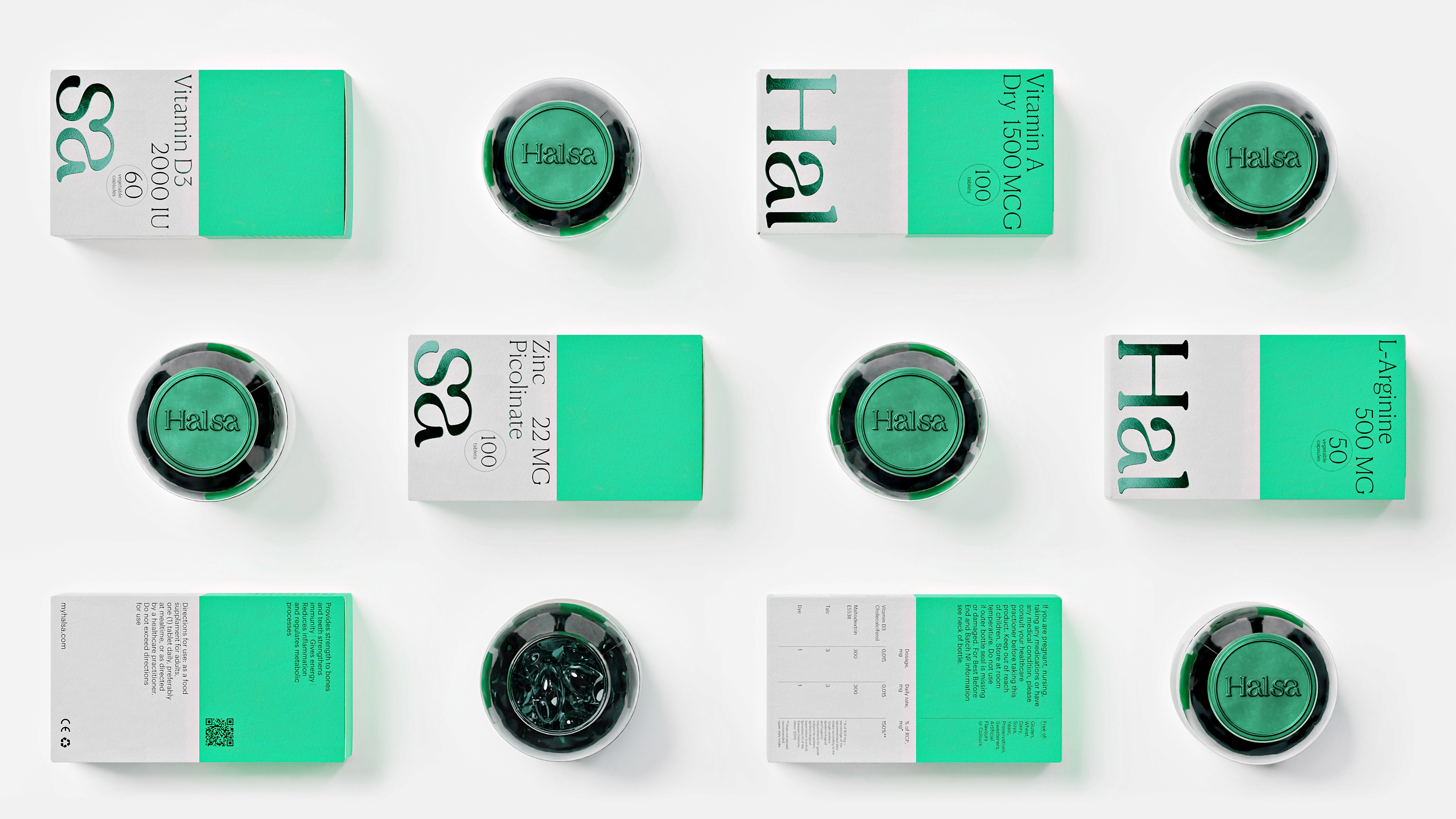
Halsa offers a subscription for personalized vitamin sets, using AI to customise monthly nutrient combinations. The rebranding integrated Halsa into the E-commerce 2.0 space. It introduced a unified digital and physical design language, highlighting its focus on self-care and a healthy lifestyle.

The packaging's modular design, consisting of two cubes, encourages regular vitamin use. You can place the cubes in various locations, simplifying adherence to your vitamin regimen. The functional typography and the distinct green color in the packaging reinforce Halsa's identity as a trustworthy health brand.


Paintings by Stepan Lipatov, Rodion Kitaev, and Alisa Gvozdeva depict the journey towards wellness, either symbolically or through abstract art. These visuals complement the logo's smooth lines, and their fluidity, enhanced by emerald foil, adds to the brand's appeal, suggesting vitality and adaptability.


FEATURED DELIVERABLES
FONTS USED
Commercial Type, CSTM Fonts
Commercial Type, CSTM Fonts
Shuka
creative strategy director
creative director
senior design director
lead designer
designer
3d visualisation & motion
3d models
illustrator
illustrator
illustrator
project manager
head of content
lead content producer